Thesis Concept: Module 9
This module I updated my logo more to appeal to scaling and I adjusted the diamond/leaves on it to seem more like the marijuana leaf. I also updated some of the graphic elements.
Upon updating the branding visuals, I'm starting to think I might need to simplify the color palette to have more contrast and elegance; this is something I will explore this in the next week. I've also have been working on a tagline for the brand, which will hopefully will be finalized soon.
I did more font explorations for the headlines, displayed in the desktop website. If neither of the Serif fonts work, I might just use Gotham instead.
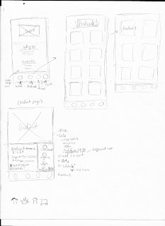
For my website deliverable, I am also making the mobile version of it too. I originally wanted it to be an app, but I'm not sure if that is plausible at this point or how to make it different than the desktop. The desktop websites shown are to figure out possible layouts.
I did the wireframes for the mobile website because most of my TA would use their phones. Once things get more refined, I will adapt the layout/navigation onto the desktop website. Because my sketches are terribly messy, I created rough comps on Adobe XD.


Comments
Post a Comment